Killer
Kebab
Killer Kebab is a Copenhagen based startup eatery that sets itself apart from the abundance of kebab shops already present on every street corner by using fresh, carefully selected ingredients and preparing everything from scratch.
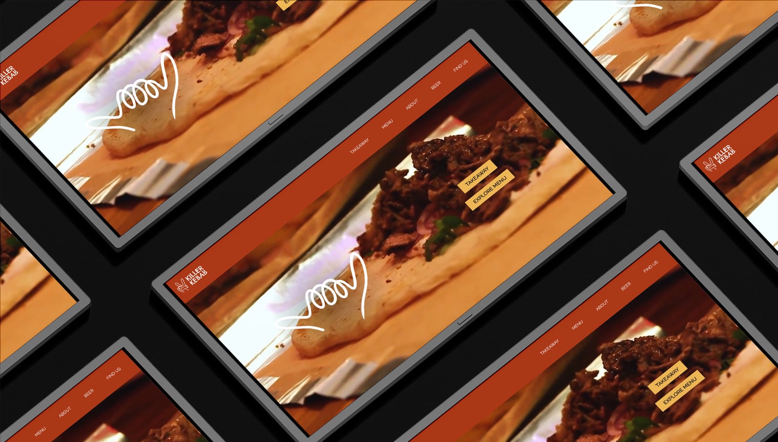
Homemade.
Healthy.
Delicious.
Team Size
2 Developers & 2 Designers
Role
Research, Synthesis, Wireframes, Brand Guidelines, Photography, Videography, Testing
Duration
10 weeks
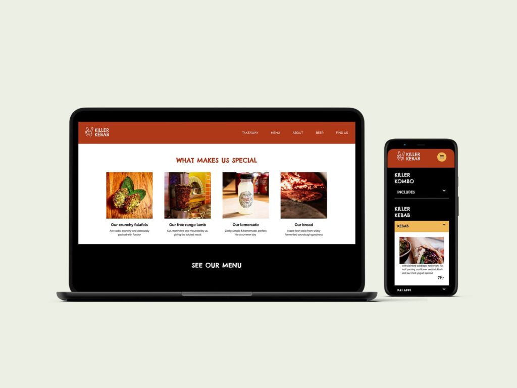
Problem formulation
The objective was to develop a distinctive online platform that sets Killer Kebab apart from competitors by conveying their fundamental principles through a unique visual and tonal identity. This approach was aimed at boosting sales and appealing to the desired customer base via their website and social media tactics and content.
Emphatize
* Interviews
* Surveys
* 5-second testing
* Think aloud testing
* Sender analysis
* PESTLE
* Design benchmarking
* Desk research
* Trend analysis
* OMD Customer Journey
Define
* Synthesis
* How Might We statements
* Personas
* User Stories
Ideate
* Crazy 8’s
* Wireframes
* Moodboards
Prototype
* Brand Guidelines
* Photography & Videography
* Prototyping in Figma
Testing
* BERT testing
* Trunk test
* Think Aloud Test
* CTR tool Storybase (SEO) & Lighthouse
Understanding the problem
Overall, we have worked with a variety of tools and methods, which would allow us to be really user-centred. To emphatize with the users, we conducting qualitative interviews and testing.
We estimated that with a small and intimate shop, it would be best to get to know the client and the people who go there. And so, we created personas, surveys and conducting in-depth interviews with the target group to understand the users needs.
The company’s biggest problem was their current inability to showcase their personality and uniqueness online. We decided that our focus go towards eg. BERT-testing and 5-second tests, rather than eg. Card sorting and tree testing. The latter would have been relevant if we were fixing their IA (information architecture) as the main problem.
How we emphatized
To gain a thorough understanding of the target audience and their preferences, we employed various research methods such as desk research, user interviews, surveys, and 5-second test.
We concluded the importance of having an ordering system on the website, driven by both the current pandemic, as well as Killer Kebab’s target audience consumer behaviour and preference of ordering food to go online. Its important to consider optimizing the
menu.
For social media platforms we decided to focus on Instagram as the primary channel and look into creating a strategy that is viable for them
and can help increase exposure.
We also decided to create video content that focuses on storytelling and translates the real life experience of being a guest at the restaurant to a digital format, keeping Killer Kebab’s fun and playful identity in mind.
As our design process is user centered we decided to ask Killer Kebab’s target audience questions to better understand their mental models.
Eating habits, as well as their preferences in regards to kebabs/falafels. We went into how the current pandemic has affected their behaviours.
Then we dove into their online preferences, in regards to social media as well to websites and specific features that they enjoy.
Lastly, we asked a specific question in regards to the name “Killer Kebab”, as there were some concerns that it might have a negative connotation and we would perhaps as a solution need to come up with a tagline.
Synthesis:
We utilized a screenshot of their homepage to develop a set of four questions aimed at determining which aspects of the website require further attention, the type of emotions or thoughts it could elicit in users, and their perception of the target audience.
https://app.usabilityhub.com/tests/75e94af39609/results/64c5f4b05de3Going in depth
Target Audience
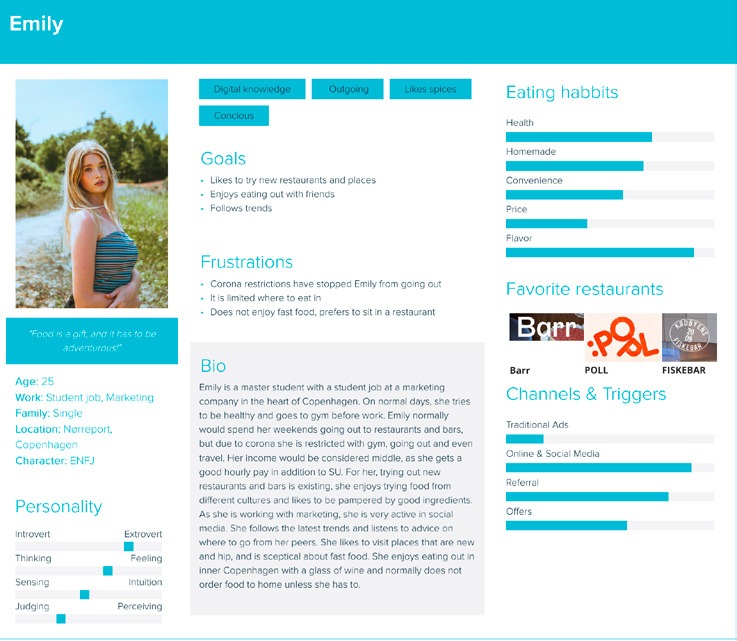
Synthesising our research gave an insight into the target audience and gave clarity to their needs, priorities and behaviours. We began to see patterns emerging.
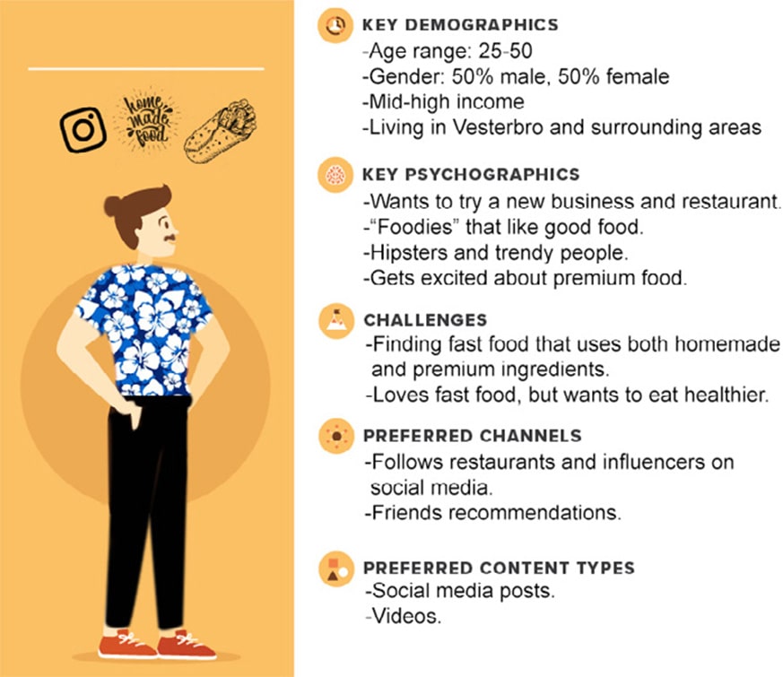
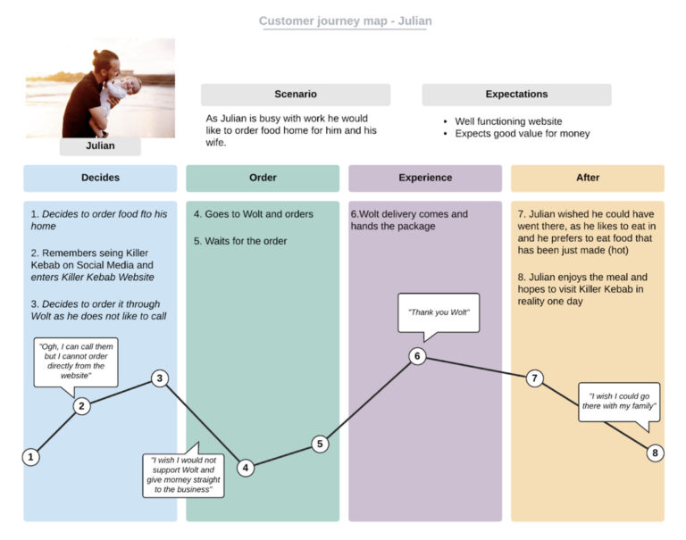
Personas & Customer Journey
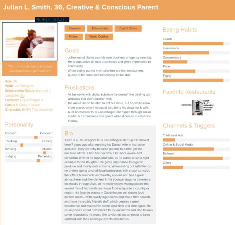
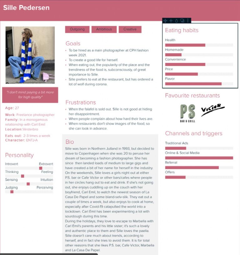
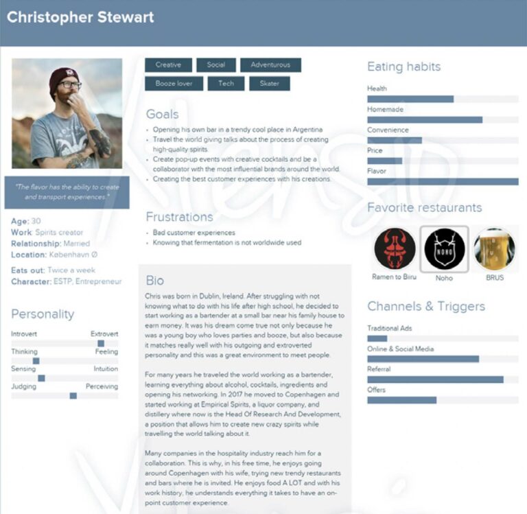
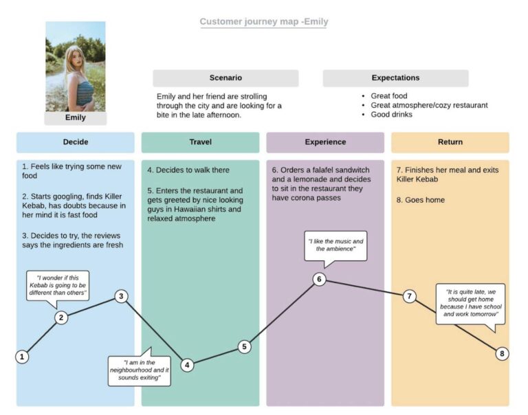
Process
Since Killer Kebab is a startup and did not have any material, I (we) had lots of creative freedom to create the brand from scratch.
Mobile Wireframes
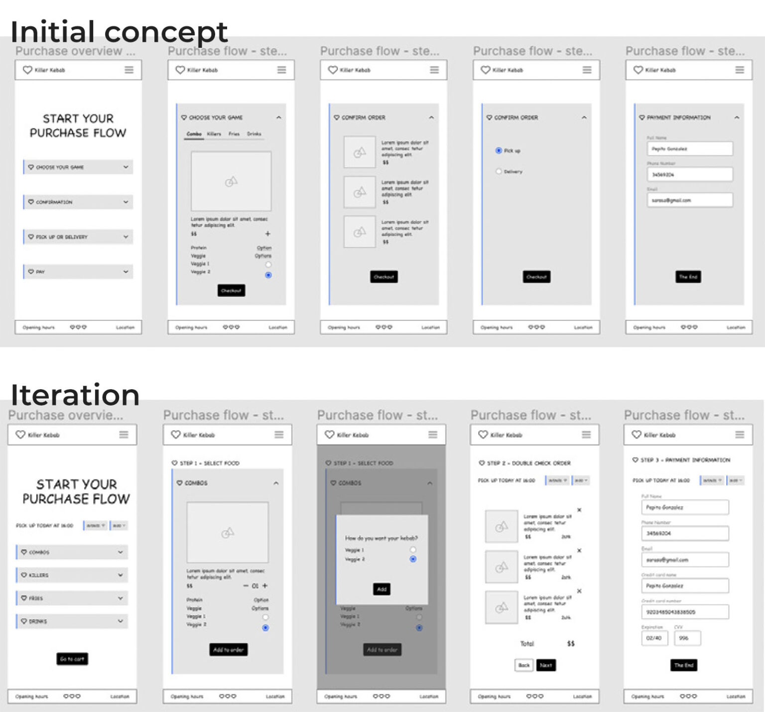
We designed the wireframes using the mobile first philosophy. The
decision was made not only because we wanted to create a better
user experience by starting the design process from the smallest
screen but also because we understood that the majority of our target
audience make use of their mobile device rather than desktop to order
food.

Think Aloud
To ensure the usability of our solution, we carried out 5 Think Aloud Tests on 4 participants aged between 27-50 using our Figma prototype.
One participant (32), tried to add an order to the basket when looking at the menu and mentioned that she didn’t realize that the menu didn’t add to cart. Because of this we added “See” in the “our menu” subheading and to expand he menu a conventional “arrow down” button, to indicate that the menu is mainly used to look at the products, and not to order through.
Final Thoughts
When analysing the market we looked for several features to differentiate Killer Kebab eg. by implementing video in the hero banner that visualizes the making of their products as well as utilizing video content in their social media channels to increase their user engagement rate and widen their reach and ways of improving the digital customer experience eg. through personalization in the order confirmation and the creation of a QR code to display the menu taking the current pandemic into account and potential low-cost guerilla marketing efforts.
We aimed at communicating their core values of being wholesome, homemade and friendly in a way that would appeal to their Millennial target audience as described in our research and personas, through both their website and social media channels with content and functionalities that are relevant & in line with their brand, from their ordering system to the content on web and social mediaplatforms.

